
Transforming a simple Google Sheet into a useful, visually appealing dashboard is easier than you might think. With Gyule.io, you can connect your spreadsheet and instantly create charts that update automatically. In this guide, I’ll walk you through the entire process step by step.
What Is Gyule.io?
Gyule.io is a platform that allows you to turn Google Sheets into beautiful, customizable dashboards. At the moment, it supports Google Sheets as the main data source, but more integrations will be added in the future.
Before you begin, make sure you already have a Gyule account and a Google Sheet ready with the data you want to visualize.
To create a Gyule account, you can sign up here: www.gyule.io
Connect Google Drive to Gyule.io
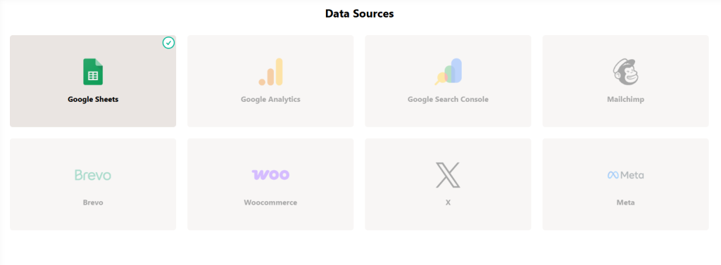
The first step is to connect your Google Drive account.
From the Gyule settings you have to click “Google Sheet” and then click the button “Add connection”.
The standard Google process will then open to complete the connection.
After connecting your account you can start creating a dashboard.
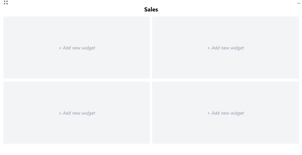
Create a New Dashboard
From section “Dashboards”:
- Click Create Dashboard.
- Enter a name for your dashboard.
- Choose the number of rows and columns.
You can choose up to 3 rows and 3 columns. For example, if you want four charts, a 2×2 layout works perfectly.
Your dashboard is now set up and ready to be customized.
Add Widgets
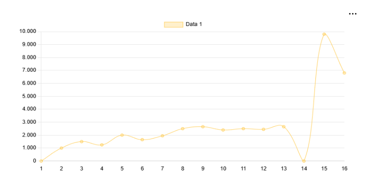
Now it’s time to add your first chart:
- Click on an empty block and give it a title.
- Choose the block type to display either a chart or a card.
- Choose the widget type. In our case, select Google Sheets.
- Choose the file from your Drive.
If you have many files, you can search by name. - Select the sheet that contains your data.
- Define the data range — you can simply copy and paste it from your Google Sheet. You must use the same format used in Google Sheets or Excel, for example “A1:A15”.
- Pick the chart type. You can choose from “Line”, “Area”, “Bar”, “Pie”, “Doughnut”, “Card”.
After saving your first chart is now ready!
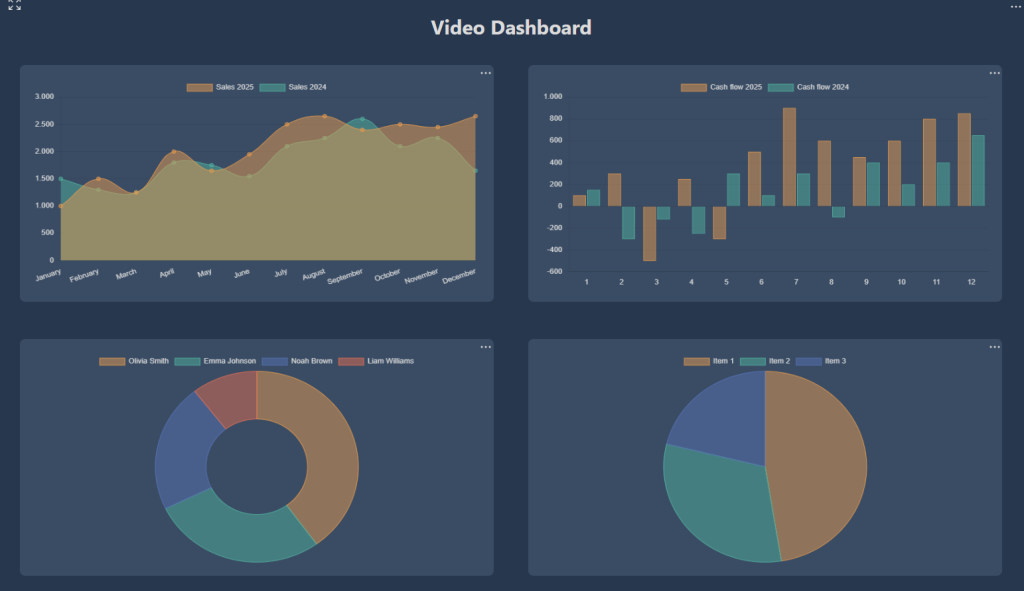
Customize the Chart
Before adding more widgets, you can tweak your chart by clicking the three dots at the top right of the graph.
You can:
- Change the block name: In the settings tab you can change the block name.
- Add additional data series: In the data tab you can “Add data”, for example, you can display Sales 2025 and compare them with Sales 2024 by adding a second range. This is possible only in Line, Area e Bar charts.
From here you can also rename the data series. - Change the labels: If you don’t want labels like “1, 2, 3”, select the “Labels” tab and insert the data range from your sheet.
Once saved, your chart will automatically update with the new settings.
Edit Your Dashboard
After adding and customizing the remaining widgets, you can personalize the entire dashboard by clicking the three dots at the top right of the dashboard.
You can:
- Change the dashboard name
- Change the theme by choosing between Blank, Dark, and Gyule themes.
That’s it! Your Google Sheet is now transformed into a fully functional dashboard.
Leave a Reply